
Monday, May 13, 2013
Sources and Info for Restaurant Project
Project done in Adobe
Illustrator
Large Typeface: Luna Bar (from DaFont.com)
Body Text: Calibri (from Computer)
Bullets: Bodoni Ornament (From Computer)
Paper used: 11 X 17 single weight matte
Artboard size: 7 X 14
Menu (folded) size: 7 X 7
Bag Template: http://dc317.4shared.com/doc/p3cjPgm7/preview001.png
Big Coffee Picture: https://upload.wikimedia.org/wikipedia/commons/c/c5/Roasted_coffee_beans.jpg
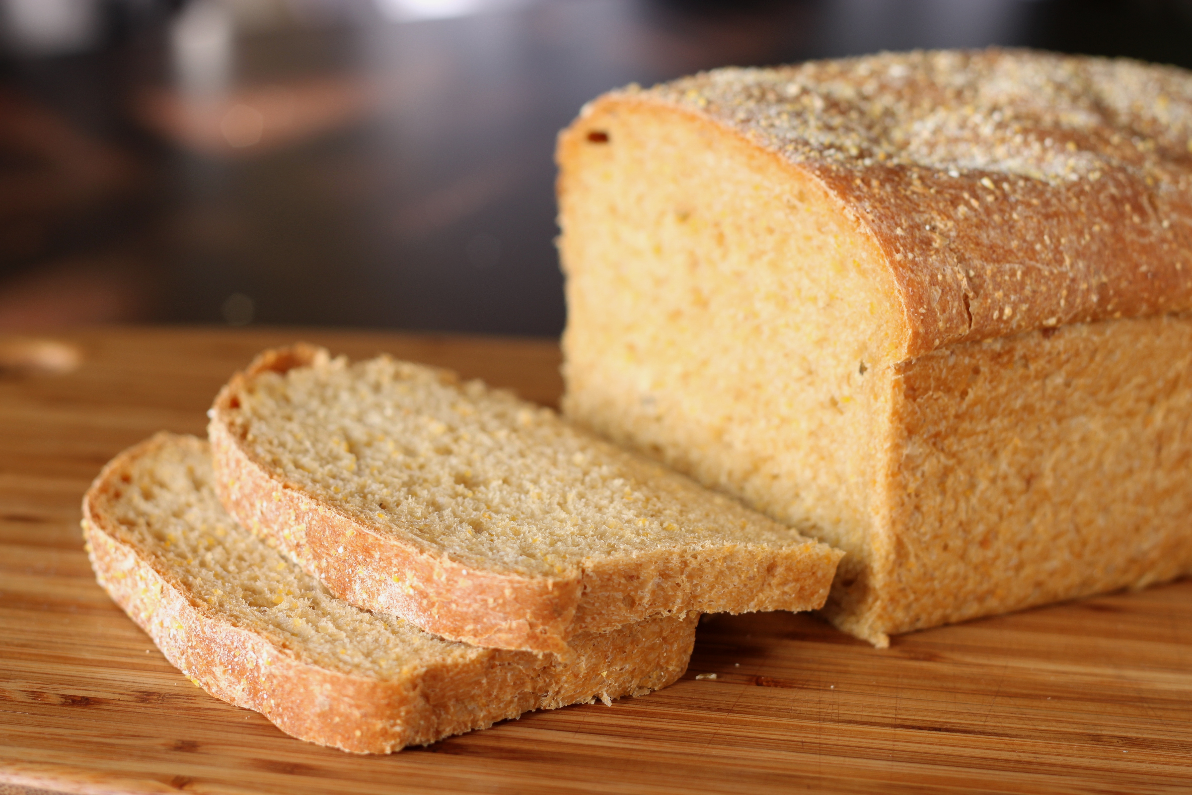
Big Bread Picture: http://upload.wikimedia.org/wikipedia/commons/7/71/Anadama_bread_%281%29.jpg
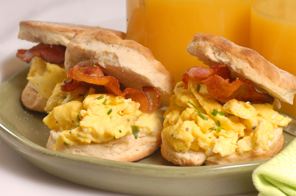
Menu Breakfast Sandwhich: http://cdn.sheknows.com/articles/2010/08/breakfast-sandwiches.jpg
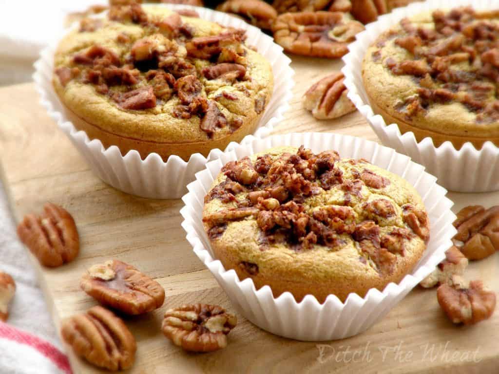
Big Muffins: http://ditchthewheat.com/wp-content/uploads/2012/09/MAPLE-PECAN-MUFFINS-3-WATERMARK.jpg
Espresso pic: http://www.newhollandcoffee.com/i/coffeepics7.jpg
Big Cup of Coffee with Heart Foam: http://thenespressoguide.com/wp-content/uploads/2012/07/espresso-cappuccino-1541.jpg
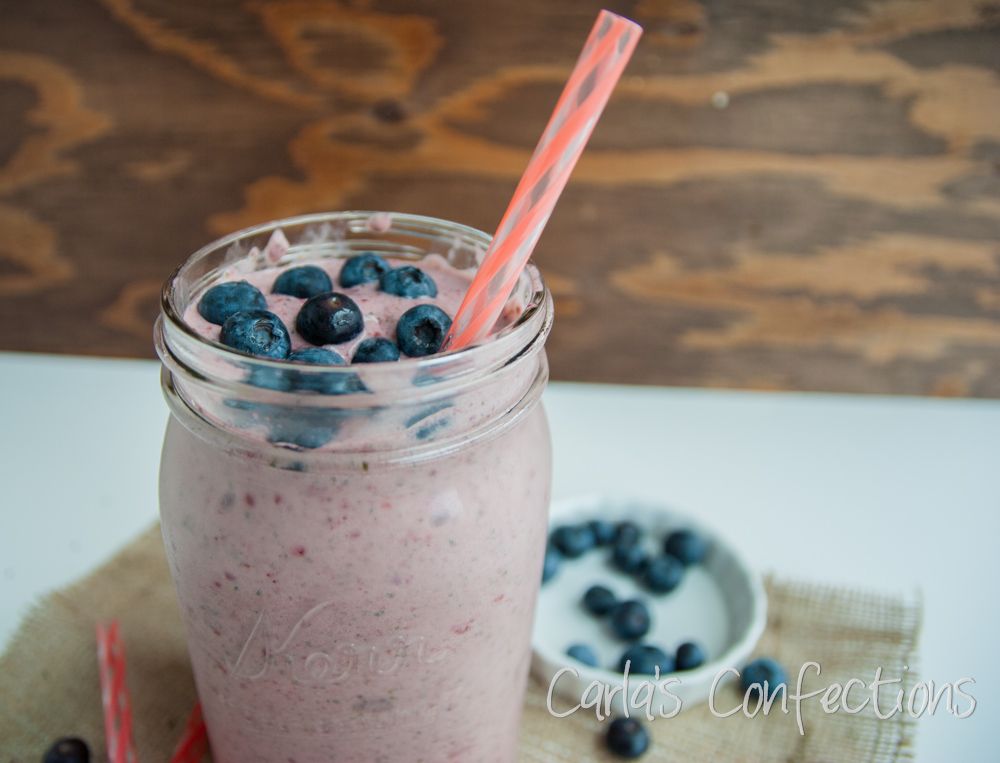
Big smoothie: http://i1158.photobucket.com/albums/p612/carlasconfections/FruitSmoothie4_zps4d6a1250.jpg


Saturday, April 27, 2013
Week 11


Wednesday, April 17, 2013
Week 10


Monday, April 15, 2013
Poster Inspiration


These fun and varied types were the beginning of my inspiration to use different types in the title of my poster. I like the organic and casual feel they give, and incorporated a similar feel in my project.
Subscribe to:
Comments (Atom)