
Monday, May 13, 2013
Sources and Info for Restaurant Project
Project done in Adobe
Illustrator
Large Typeface: Luna Bar (from DaFont.com)
Body Text: Calibri (from Computer)
Bullets: Bodoni Ornament (From Computer)
Paper used: 11 X 17 single weight matte
Artboard size: 7 X 14
Menu (folded) size: 7 X 7
Bag Template: http://dc317.4shared.com/doc/p3cjPgm7/preview001.png
Big Coffee Picture: https://upload.wikimedia.org/wikipedia/commons/c/c5/Roasted_coffee_beans.jpg
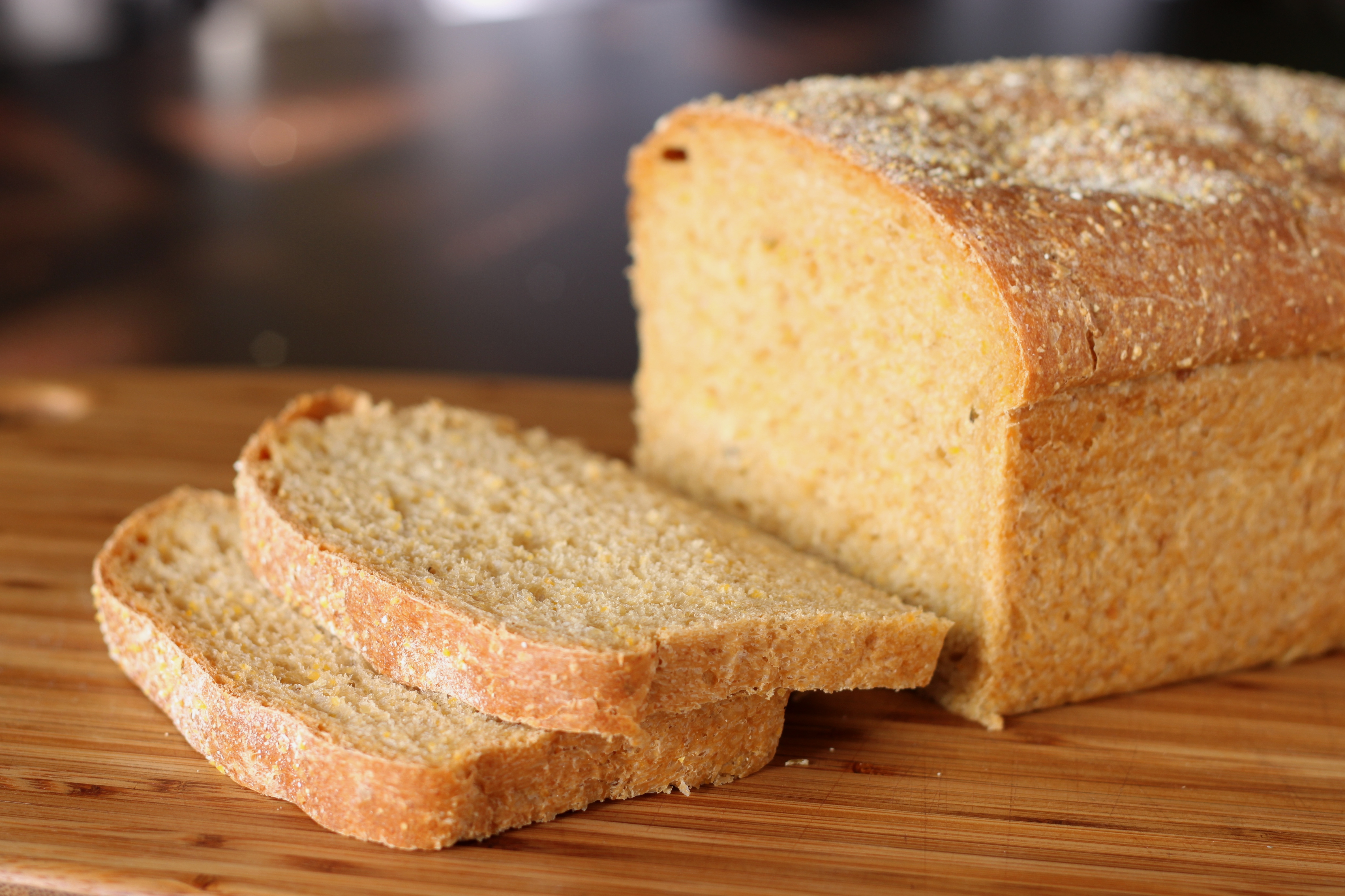
Big Bread Picture: http://upload.wikimedia.org/wikipedia/commons/7/71/Anadama_bread_%281%29.jpg
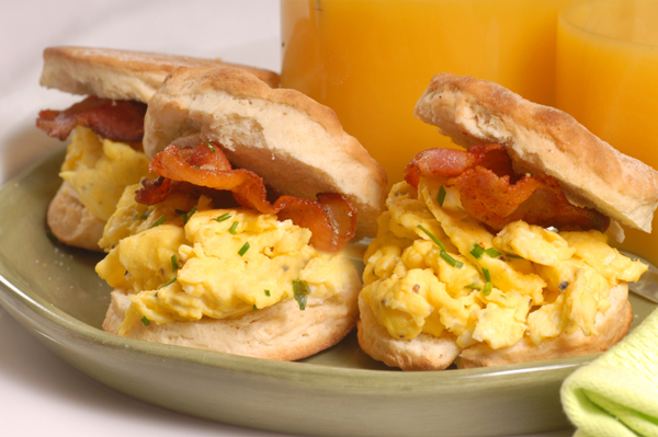
Menu Breakfast Sandwhich: http://cdn.sheknows.com/articles/2010/08/breakfast-sandwiches.jpg
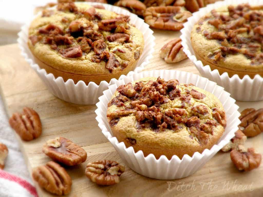
Big Muffins: http://ditchthewheat.com/wp-content/uploads/2012/09/MAPLE-PECAN-MUFFINS-3-WATERMARK.jpg
Espresso pic: http://www.newhollandcoffee.com/i/coffeepics7.jpg
Big Cup of Coffee with Heart Foam: http://thenespressoguide.com/wp-content/uploads/2012/07/espresso-cappuccino-1541.jpg
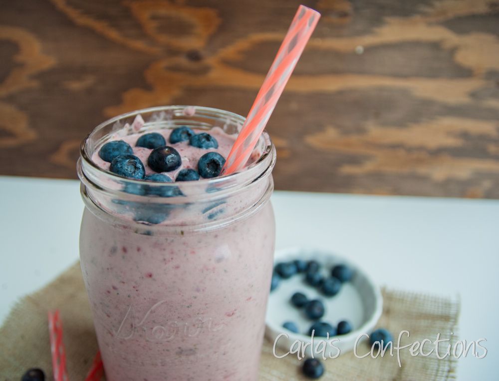
Big smoothie: http://i1158.photobucket.com/albums/p612/carlasconfections/FruitSmoothie4_zps4d6a1250.jpg


Saturday, April 27, 2013
Week 11


Wednesday, April 17, 2013
Week 10


Monday, April 15, 2013
Poster Inspiration


These fun and varied types were the beginning of my inspiration to use different types in the title of my poster. I like the organic and casual feel they give, and incorporated a similar feel in my project.
Tuesday, April 9, 2013
Week 9


Week 8

The layouts that are shown in this image are really creative and original. Since we were working with grids for our poster designs recently, I found these interesting to look at. The varying typefaces and different positions of type keep things interesting and draw in the viewer. I was especially drawn in by the bright and fun colors, which can really stand out against a wall if you are trying to capture people's attention.

Thursday, March 28, 2013


Wednesday, March 27, 2013
Week 7


Tuesday, March 12, 2013
Week 6


Week 5


Sunday, March 3, 2013
Week 4


Monday, February 25, 2013


Sunday, February 24, 2013
Week 3


Thursday, February 14, 2013
Type Journal Week 2

This image, that I found on Pintrest (pinned by design enthusiast Mitchell Kraft), has many different kinds of type that all seem to fit well together. Some of the letters have serifs, like "music" and "pain" while others do not, such as "hits you." There is even some script type. I really react to this combination of typography because each line seems to have its own personality and impact, making each word seem meaningful. The differing typefaces and sizes are also reminiscent of the late 19th century advertisements that had many different typefaces and varied sizes to command attention in urban spaces.


Subscribe to:
Comments (Atom)